Berrylicious Native LP
Product & Visual Design
Product visual design of the CRM landing page promoting Pincode during Berry season
Overview
Pincode's CRM campaigns are executed through various channels, such as the Pincode icon on the PhonePe app, push notifications, SMS, and more. Users are directed to an intermediate landing page highlighting key USPs and exciting offers. These landing pages are periodically updated to align with seasonal themes and festivals.
These CRM pages drive significant CTRs from our PhonePe user base, effectively converting them into Pincode users.
My Role
My role was to lead and establish design guidelines for these landing pages, ensuring a consistent look aligned with our app's UI design principles. The goal was to create pages that seamlessly integrated with our existing design system and UI standards.
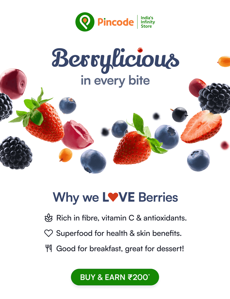
For the Berrylicious campaign, I was responsible for designing the landing page, collaborating closely with the CRM and business teams to ensure alignment with our UI approach.
DS Inspired Style Guide
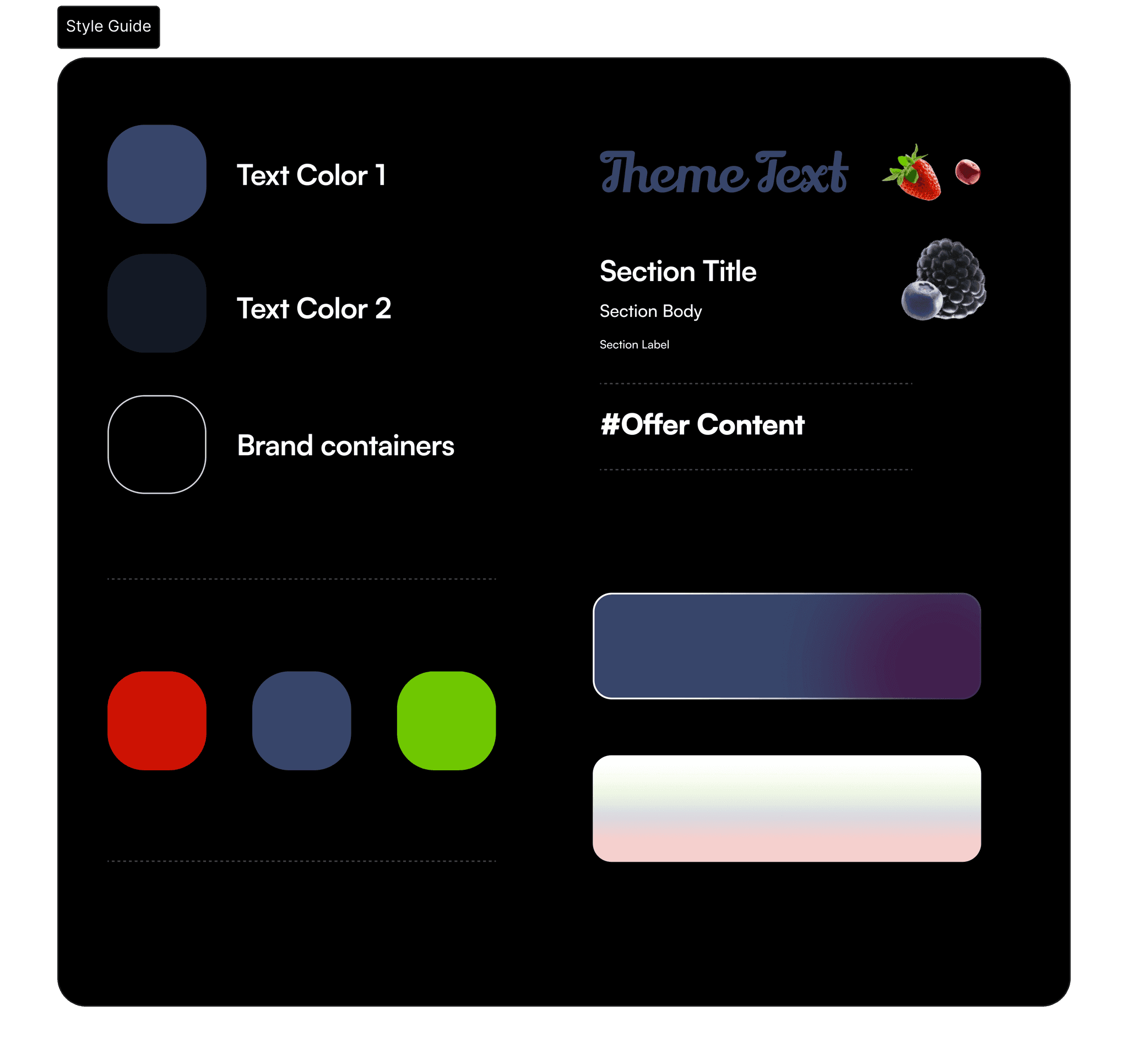
I created a mini style guide for the landing page guidelines by adopting key elements from our Design System. This guide mandates the use of minimal font choices, sizes, colors, containers, and backgrounds, ensuring consistency with our overall UI approach.
Trivia Identity
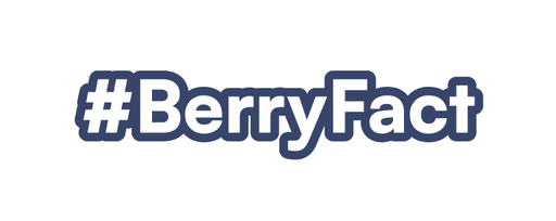
For the trivia section of the page, we implemented a minimal typographic element that stands out, highlighting the fact of the day or season with a distinct identity from the rest of the page.
Landing Page Performance: Pincode Icon Entry Success
Here’s the complete landing page as seen when users access it via the Pincode icon on the PhonePe app. This page generated 4-5% conversions during its runtime.


