Overview
This series showcases a collection of motion designs I initiated and implemented for Pincode. I collaborated closely with product designers, business heads, and product managers to understand the app's pain points and proposed motion design solutions. Each of these projects contributed to a visual uplift, positively impacting the app's success metrics.
Collaboration
For this series, I worked closely with the UI team and our in-house illustrator, Anand, who helped bring these ideas to life. I was responsible for crafting the motion interactions and prototypes, ensuring seamless integration of visuals and motion across the Pincode app.
Led the address flow revamp project with a focus on optimizing app loading speed.
- Collaborated with the Illustrator to create two animation scenarios for fast and slow loading.
- Introduced a seamless transition between the splash screen and address flow, creating an overlapping effect. Designed the transition to give users the perception of faster app loading.
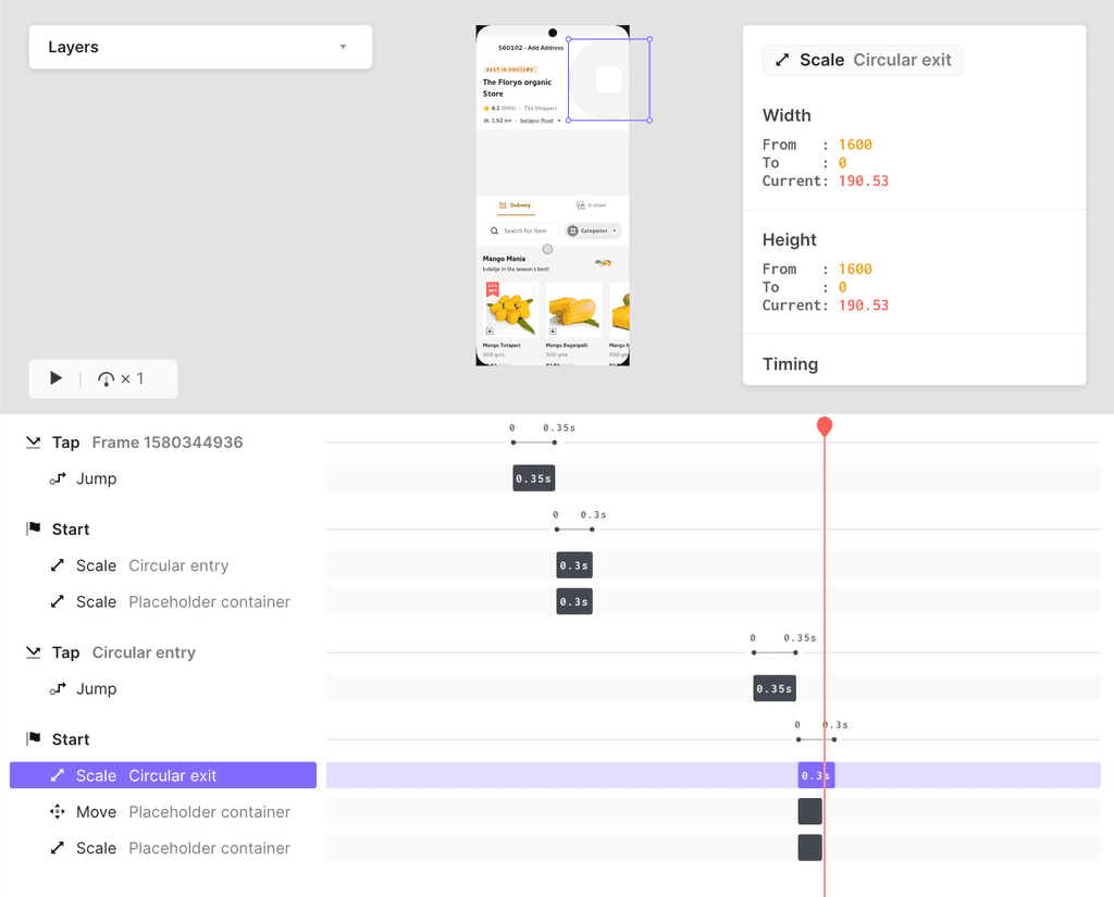
- Developed ProtoPie prototypes for accuracy and real-time experience testing.
- Retained the key concept from the previous version, integrating a Lottie animation. Ensured the Lottie animation adhered to Android splash screen guidelines as per the developer documentation.
During the initial stage of Pincode, the cart checkout process required a loader due to backend checks on user-added items, averaging 10-13 seconds.
- My role was to enhance the user experience by creating an engaging Lottie loading animation, optimized within existing technical constraints.
- I understood the product flow and crafted a narrative for the loading experience. This prototype represents the "Happy Flow," ensuring all user-added items are available for error-free checkout.
The flow demonstrates successful execution of delivery slot verification, price checks, and charges, transitioning users to the payment process.
After the delivery check, another loading screen validates that user-added items remain in stock.
- I conceptualized the cart loading animation with a clear narrative, effectively conveying the current purchase stage, supported by UX copy.
After introducing this loading experience, we received positive user feedback, further validated by improved metrics.
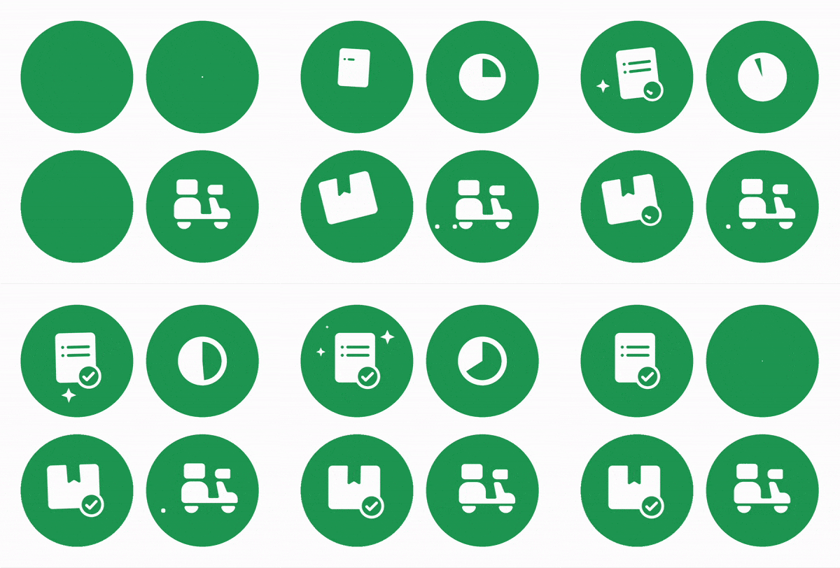
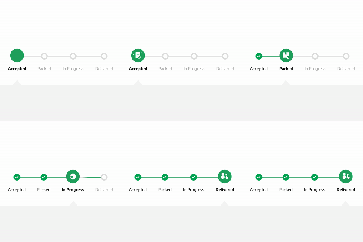
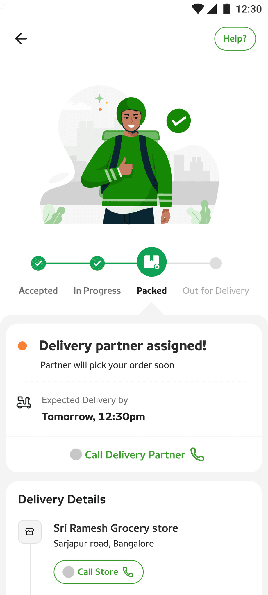
- Led the initiative to revamp motion and icon requirements for the order details page. Focused on enhancing UI, improving legibility, and providing clearer order state animations.
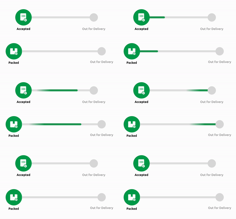
- Explored motion interactions to convey that orders were in progress and not stuck on the screen. Ensured the user experience was engaging and visually informative when interacting with the order state page.
- Designed icon animations to provide a focal point, summarizing the current state of the order.
- We saw a 7.2% increase in the cart-to-order conversion rate, with the average conversion rising from 16.3% to 17.5%.
