Problem Statement
PhonePe, with its numerous in-app products, features a wide range of user flows, including L2 and L3 pages, resulting in a complex structure of approximately 2000 screens. Given the scale of the product, each pod operated differently, leading to design inconsistencies across various areas. This was particularly evident with loaders, where multiple designs were used to represent different types of loading. There was no unified experience to help users easily understand the loading process across these various use cases.
My Role
My role involved conducting a comprehensive audit of the entire PhonePe app, documenting every loading scenario. I held 1-on-1 meetings with key stakeholders and product design SPOCs to understand the rationale and functionality behind each type of loader. This thorough analysis enabled me to identify areas for improvement and propose a new UI loader motion design system for the app.
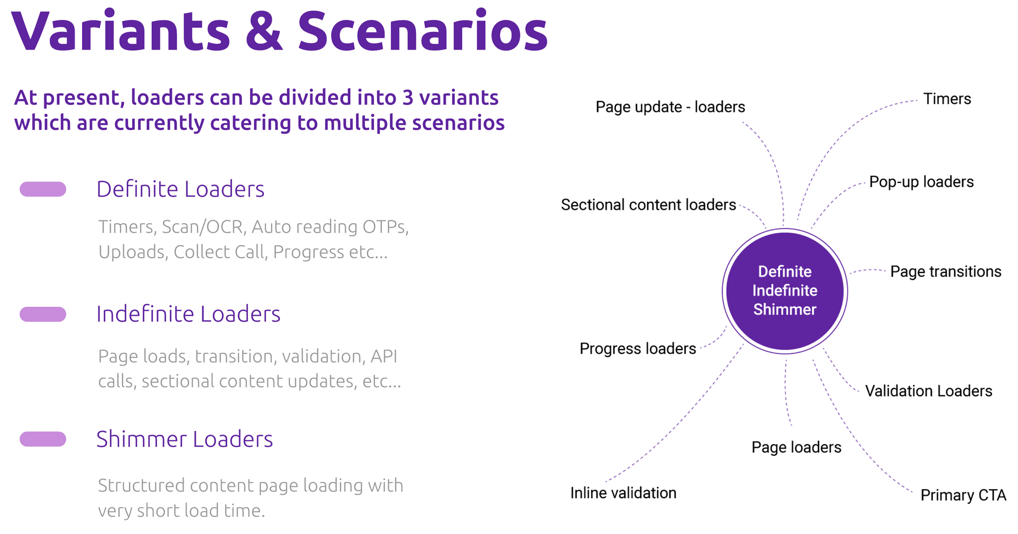
Loader Classification Framework for Design Consistency and Clarity
I classified the loaders into groups and variants to create a clear framework that would help designers, developers, and stakeholders understand and define the various types of loaders. This classification streamlined the process and ensured a more cohesive and consistent approach across the app.
Custom PhonePe-Branded Loaders for a Unique User Experience
After numerous iterations and explorations, we finalized a set of loaders that we found to be the most effective across all design areas. These loaders are functional, lightweight, cover a wide range of use cases, and align with our brand design language (Beam). These loaders were designed to be PhonePe-branded, moving beyond the generic circular loader typically seen in apps. They reflect the unique identity of PhonePe, ensuring a cohesive brand experience across all loading interactions. In this project, we will explore several of these loaders in real scenarios as implemented in our current app.


Lite loaders
These loaders address various needs, including page loading, sectional content loading, validation loaders, and more.
These loaders were divided into two variants based on screen size: the Eagle and Worm loaders, representing long and short versions of the same design. This approach ensured adaptability while maintaining design consistency across different screen formats.
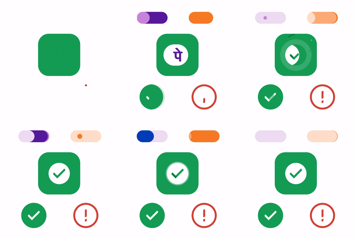
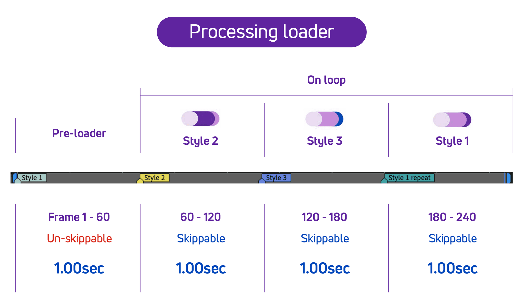
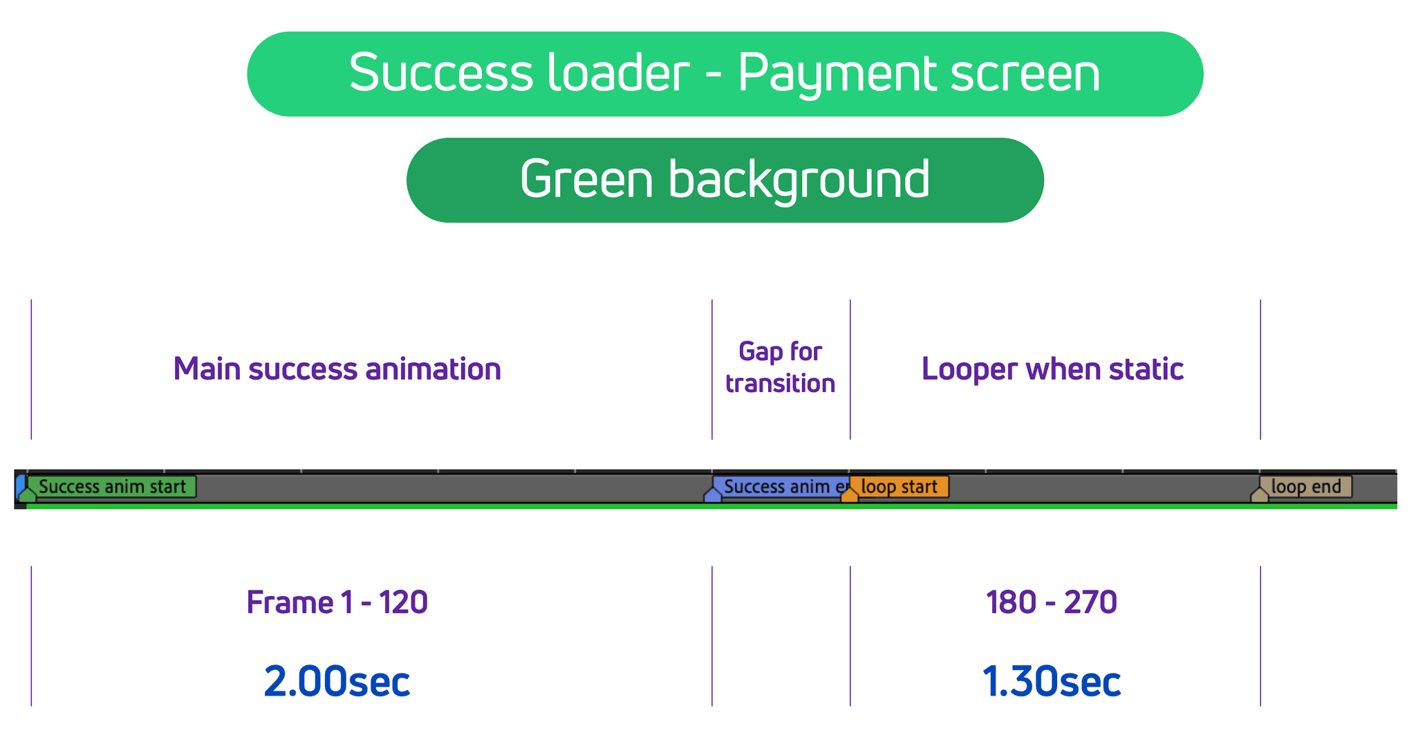
Payment loaders
We aimed to differentiate the payment loaders—specifically for processing, pending, success, and error states—from the standard loading states. Here are the ones that were implemented in the PhonePe app.

Spot loaders
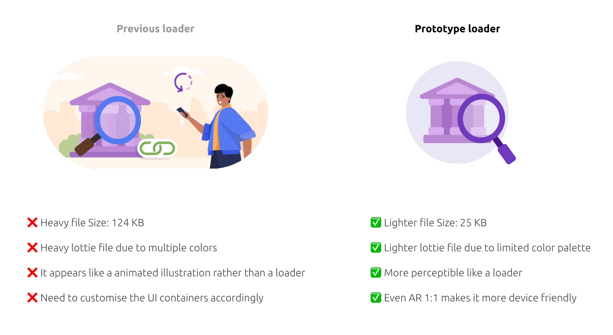
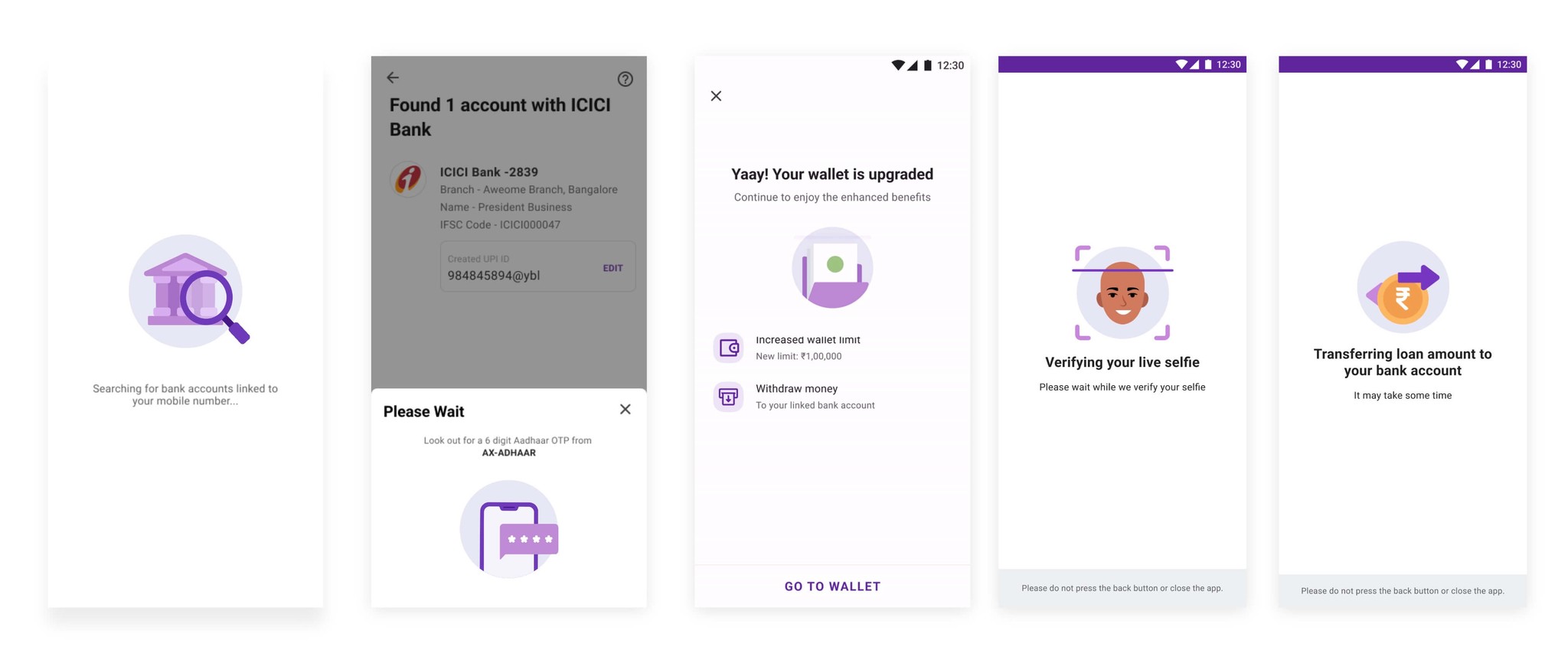
Aside from functional and payment loaders, there was a need to visually represent certain loading scenarios with animated illustrations. These visuals aimed to further communicate the purpose behind the wait time and help users anticipate the app's response. To address this, we introduced a new category of loaders called Spot Loaders, which complement our brand and serve as engaging loading indicators.
These Spot Loaders were created in collaboration with the Design Excellence team, which I was leading at the time. Together, we ensured the loaders aligned with both functional requirements and our brand identity.
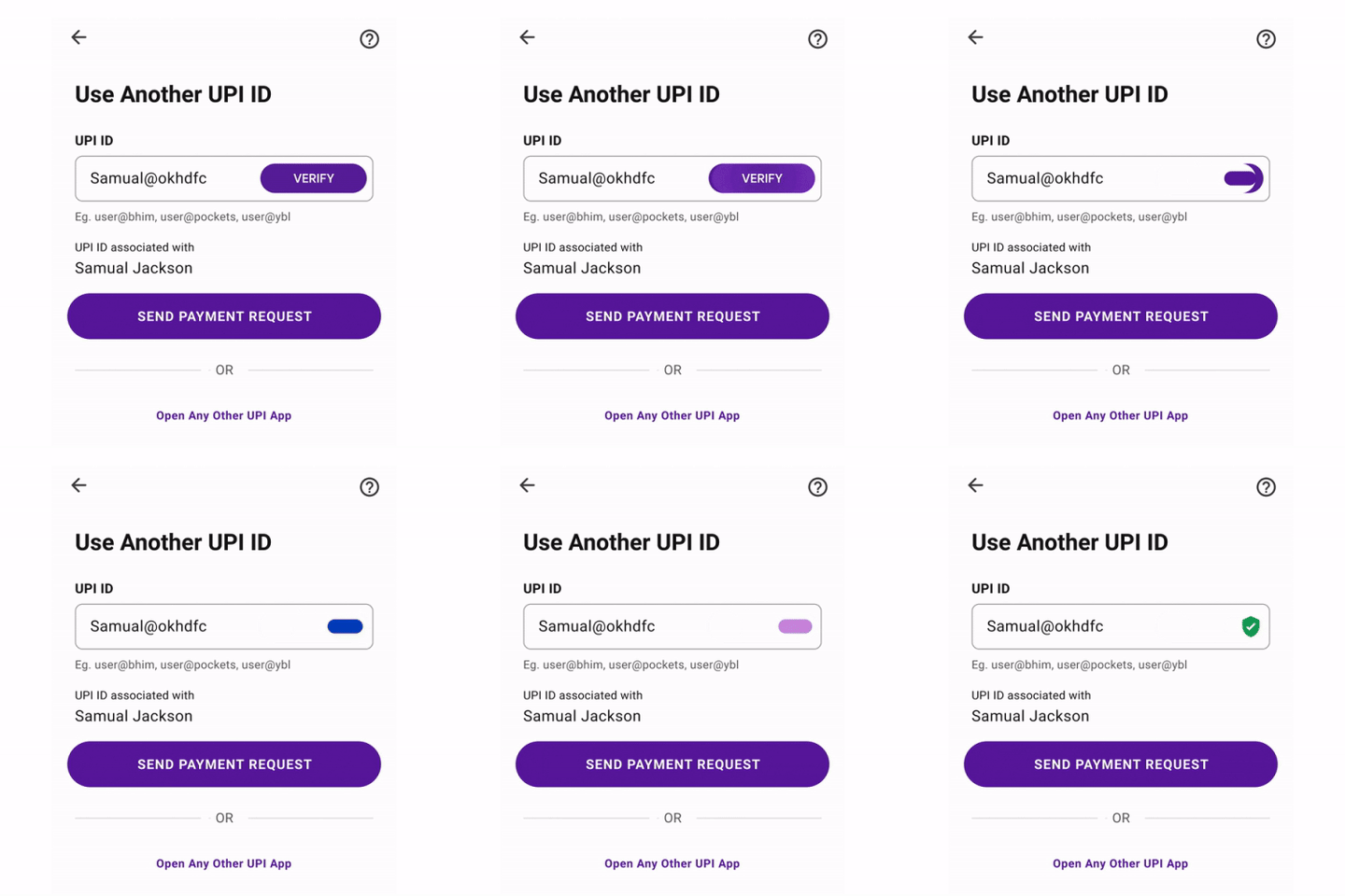
Worm lite loaders
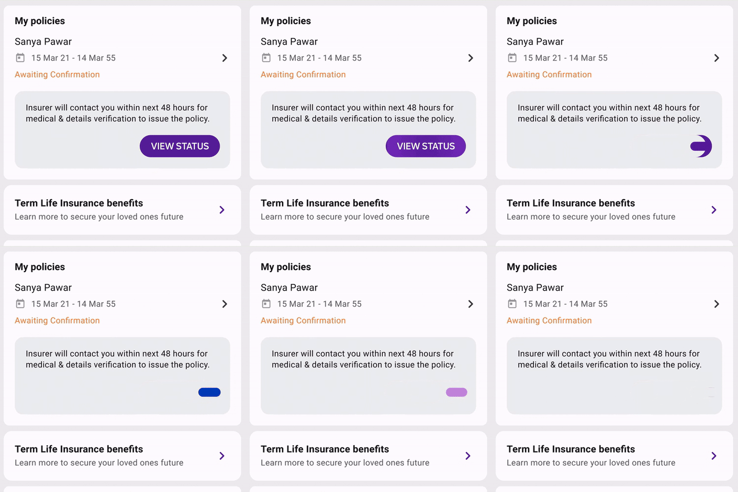
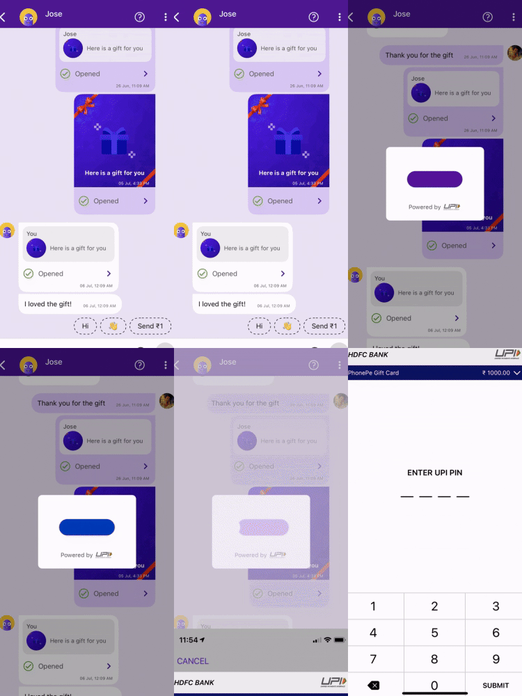
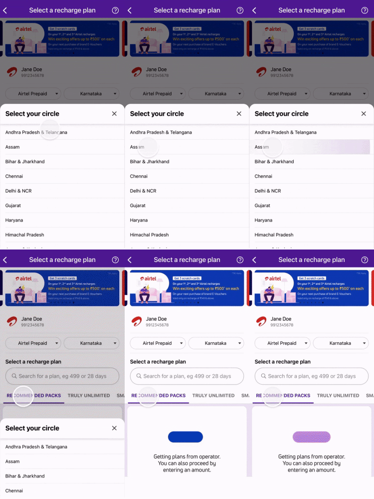
Here is a preview of the Worm Loader, typically used in smaller UI areas of the app. This loader is designed to minimize disruption, allowing users to continue interacting with the screen while content is loading.
Eagle lite loaders
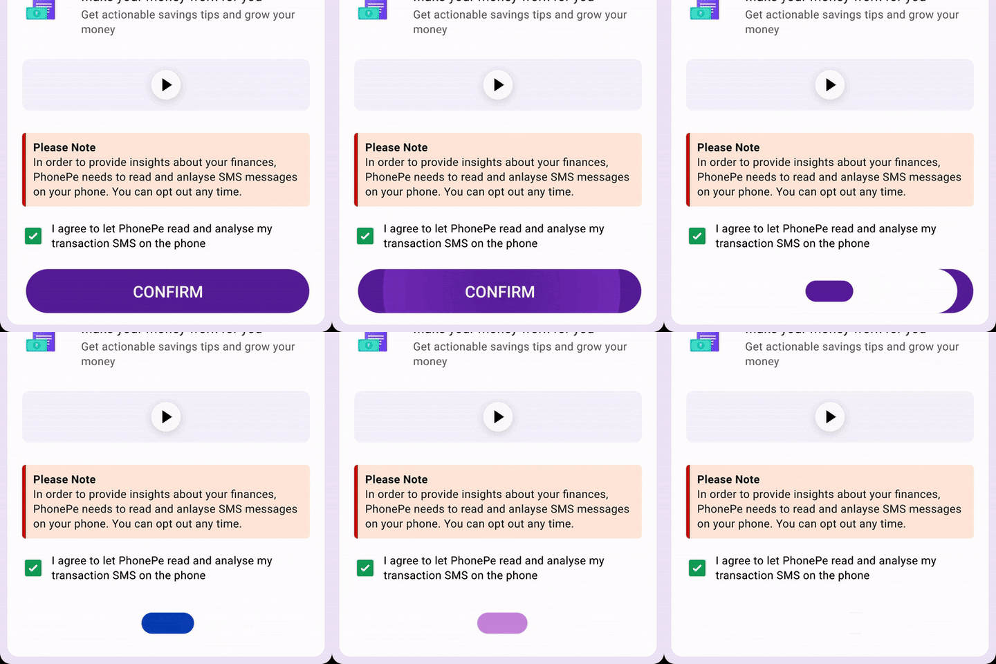
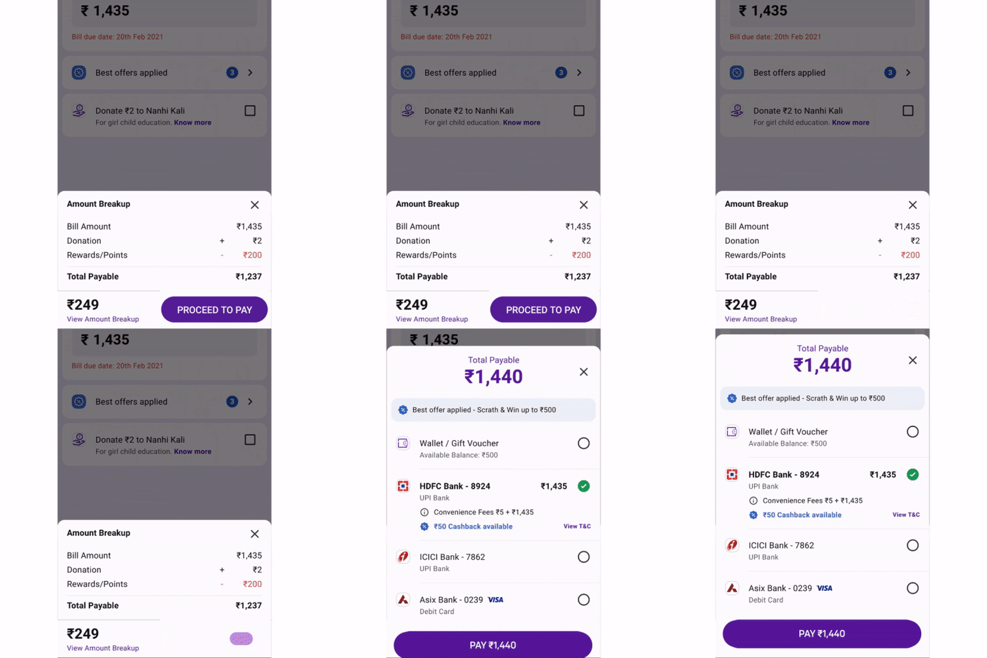
Eagle Loaders are utilized in UI spaces where content loads across the full width of the app screen, commonly seen in pop-ups and during transitions to new pages.

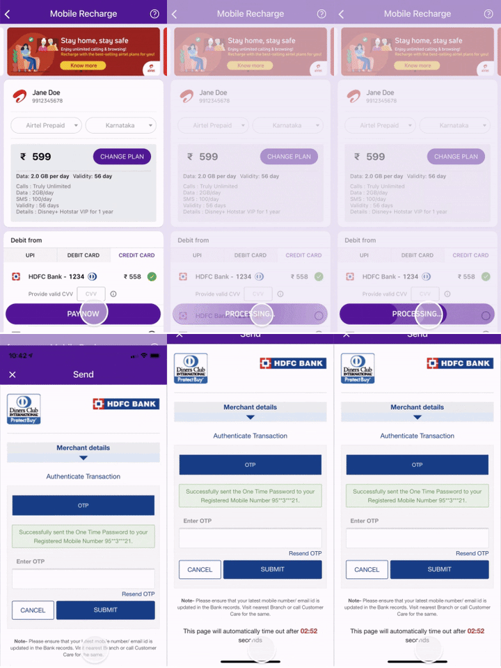
Checkout processing button
We also opted to display the checkout processing loader in a progress-style format, indicating the ongoing process and signaling that the user is transitioning out of the app.
Touch Interactions & Shimmers
I ensured that even the subtle touch interactions and shimmer animations were crafted with our brand identity in mind, focusing not only on functionality but also on creating an aesthetically pleasing user experience.


Design System Components
Here’s an example of how the beam concept was integrated into the design system components. I applied my expertise to implement loading states within button components, reflecting the inspiration from the beam design.
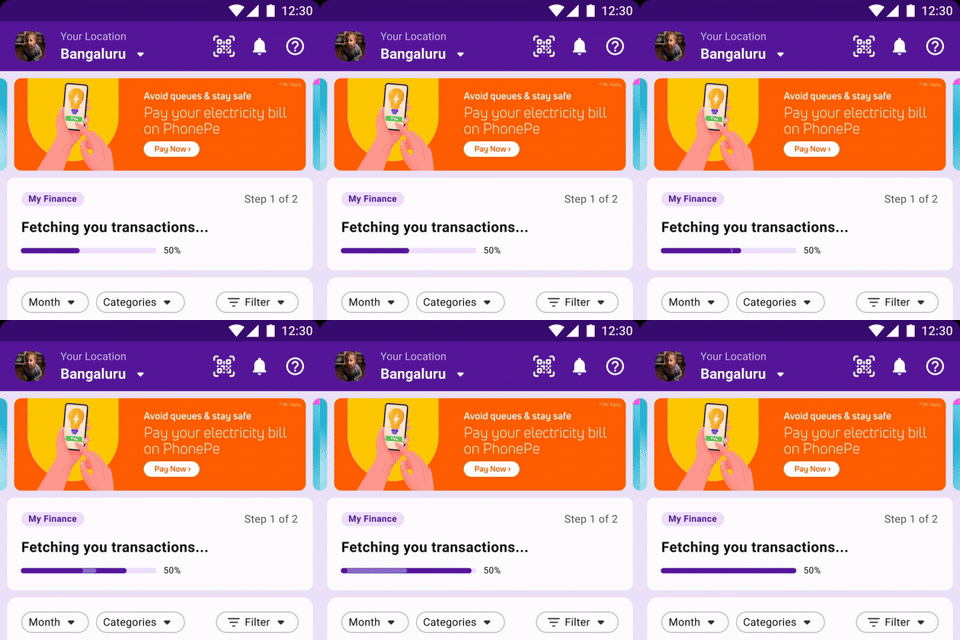
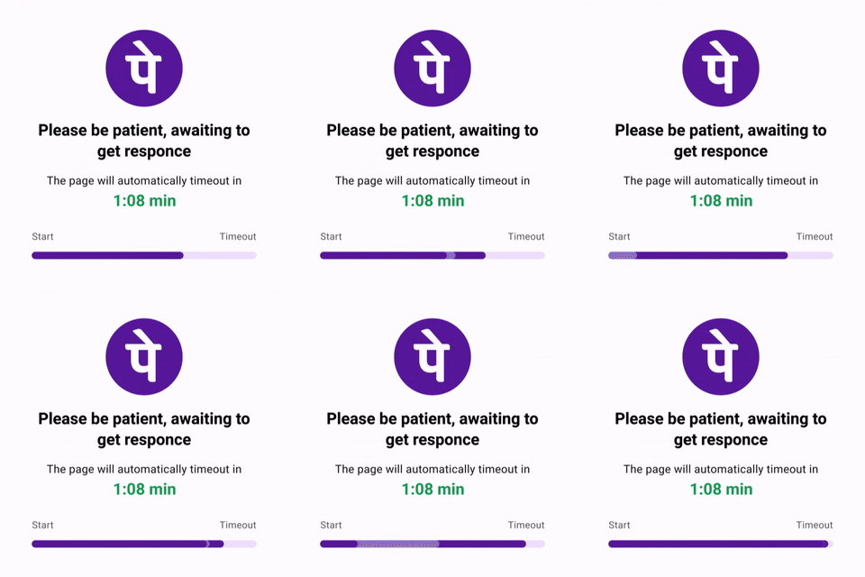
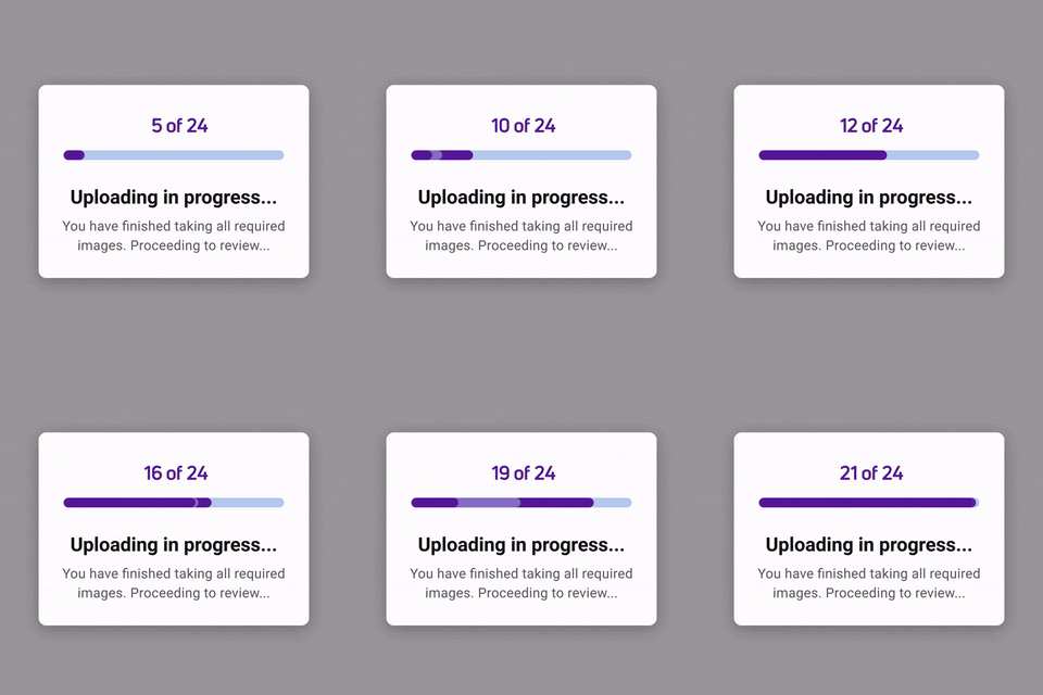
Progress bar loaders
The progress bar loaders in the app were also redesigned to align with the overall loader design. I added a subtle shimmering light effect across the progress bars to convey the sense of continuous progress, ensuring users perceive that the process is active and not stalled.
Handoff guide
Handoffs for motion design can be challenging, so to ensure a smooth process, I held multiple syncs with the development team to understand their workflow. Based on this, I created a custom motion handoff guide, making it easier for any developer to seamlessly integrate Lottie assets or prototypes into the app.
Challenges
Curating the final documentation was a complex task due to the vast number of screens I had to audit. I focused on selecting a few key recurring use cases to highlight. The challenge lay in demonstrating the visual uplift and improved loading perception, which was hard for many stakeholders to grasp. This made creating working prototypes crucial to effectively communicate the benefits. With PhonePe prioritizing its many products, getting alignment from the engineering team for the loader revamp required numerous discussions and case evaluations, especially where random generic loaders were negatively impacting the user experience. Finally, I conducted several UI review sessions with the development team to ensure the correct implementation of the new loaders.
Impact
The impact of this exercise was significant, as we began receiving positive feedback from the UX research side, with users reporting a faster and more intuitive loading experience throughout the app. This revamp became a unique initiative within our organization, setting a precedent for designing loaders that seamlessly blend branding with functional design.
Lessons
Beyond being responsible for designing every interaction and exploration in the motion design process, a key lesson I learned was to move away from thinking in terms of individual screens. Instead, I focused on recurring use cases throughout the app and how motion design could address and enhance most, if not all, of them. This approach emphasizes working efficiently, ensuring that the bulk of the groundwork is laid out early on through precise documentation and assessing the impact in collaboration with the UX team.