Overview
As gold purchases increased on PhonePe, with more users viewing it as an "investment instrument," we aimed to shift from a basic gold buying experience to an investment-focused journey of accumulation. To support this transition, we sought to enhance and elevate the UI for the Gold flows, making it more engaging for users to continue investing and track their progress. We also wanted to add a delight factor to the overall gold buying experience.
My Role
As the lead motion designer, my role was to innovate ways to make the gold buying and tracking experience more engaging. I collaborated closely with the UI team to develop concepts for accumulation and delight experiences, crafting the 3D designs and animations end-to-end. Additionally, I created speculative work to demonstrate how the UI could look and function, providing a clear vision of the enhanced user experience.


Pixar's Luca's transformation
These 3D animations were inspired by the transformation scenes in Pixar's *Luca*, where Luca shifts between sea monster and human. We aimed to capture a similar dynamic essence in this concept. I introduced a 3D gold thumbs-up animation for the post-purchase pop-up, designed to offer positive affirmation and encourage users to continue purchasing gold and silver. This animation congratulated users after a purchase, reinforcing the idea of gold as an accumulative investment.
You can view how I created a similar texture rig animation for PhonePe's dark mode here.
Gold Flow - Prototypes
I led the animated onboarding project during the PhonePe Gold revamp, overseeing storyboarding and working closely with the Illustration team to finalize visuals before transitioning to animation. After the illustrations were approved, I created the animated motion design assets, which were later implemented in the onboarding screen for first-time gold buyers. In this video, you can also see a prototype demonstrating how the *Luca*-inspired 3D thumbs-up animation was incorporated.
Gold Accumulation Concept
In another concept, we aimed to visualize the progress of accumulating gold, allowing users to set personal investment targets. This approach was designed to make the gold-buying journey more engaging by providing a sense of achievement as users move closer to their goals.
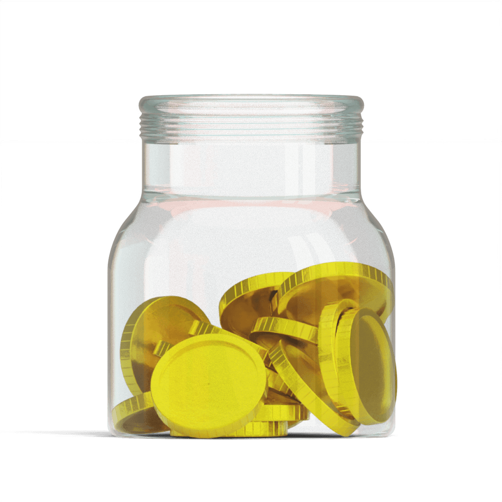
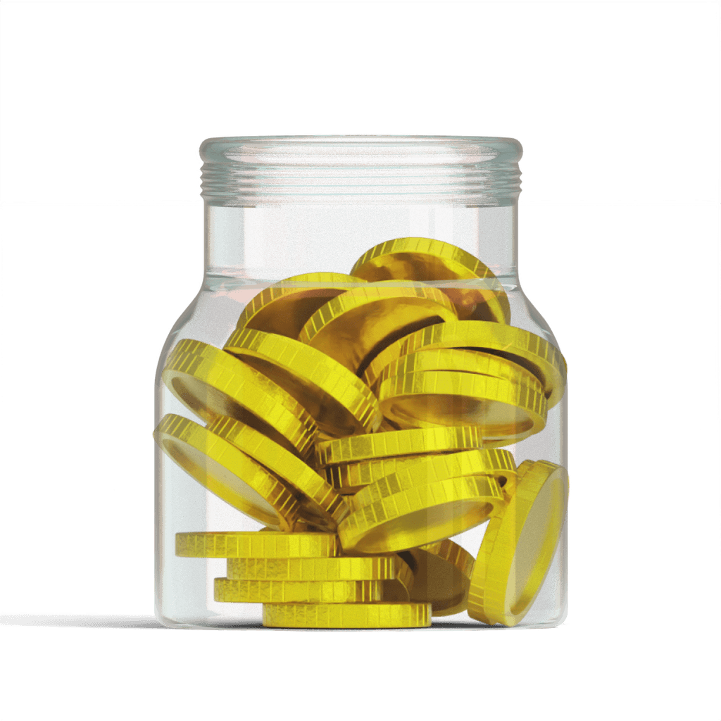
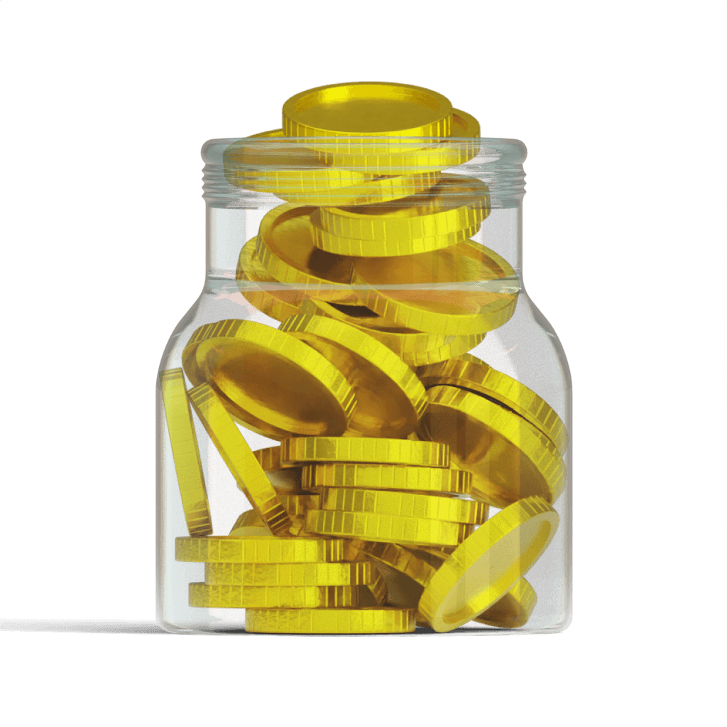
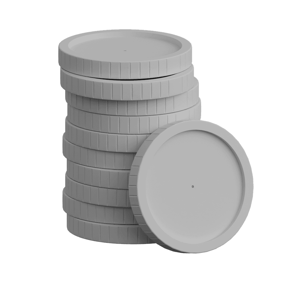
Out of the many ideas, we ultimately decided to move forward with a concept featuring a jar gradually filling up with coins, symbolizing the user's investment goal. The 3D illustrations of the jar and coins change dynamically, increasing as the user makes progress on their investment journey, providing a visual representation of their achievements.
Behind the scenes - Gold speculative concept
In this video, I aimed to demonstrate the execution of the UI design and 3D design, showcasing how the final product would look and feel. This speculative work is not aligned with PhonePe's branding but serves to illustrate my personal vision. The video also includes a timelapse of the entire design process.
Gold 3D Visual Assets for UI and Brand
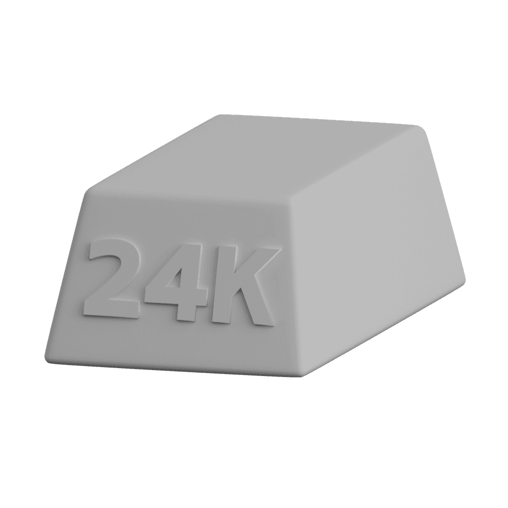
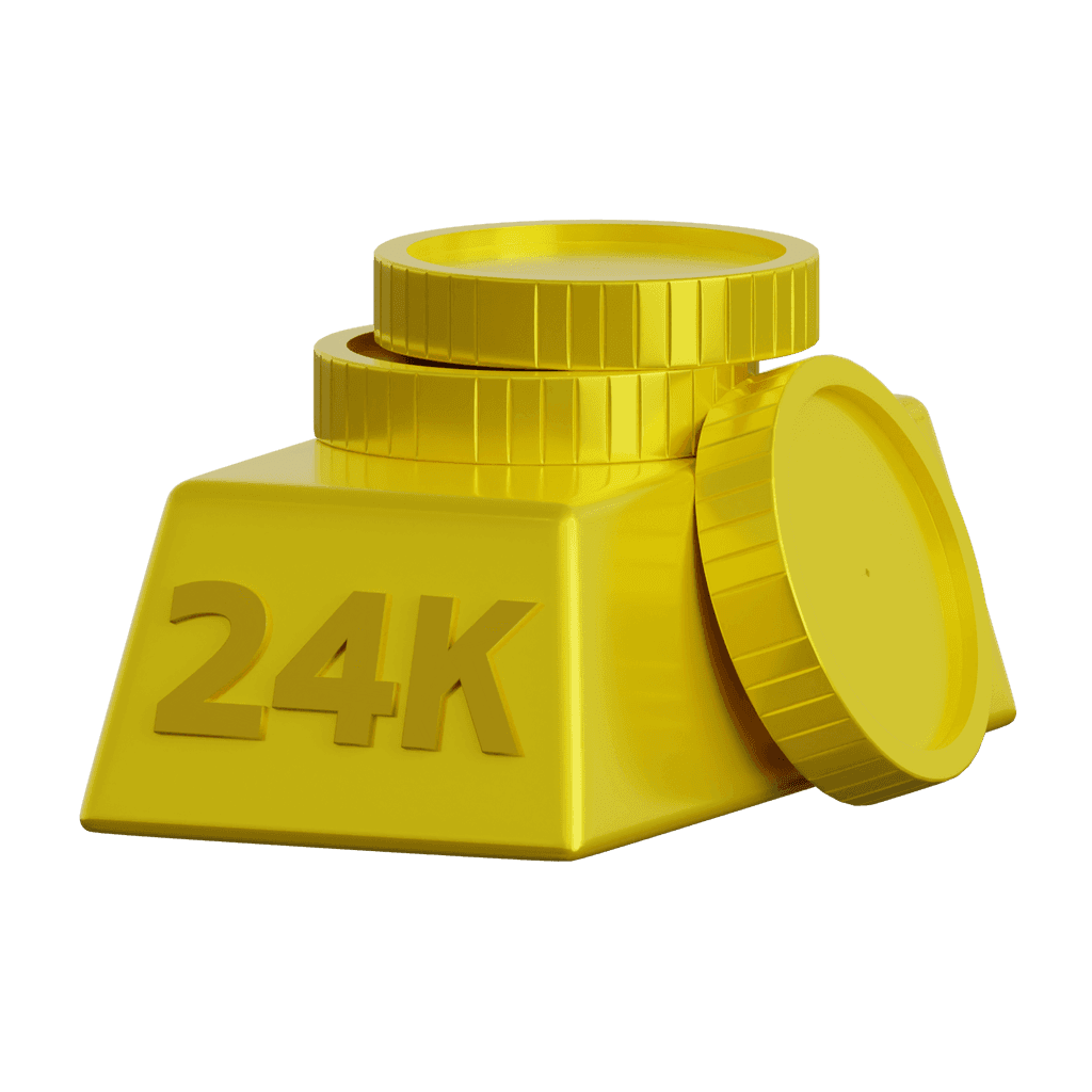
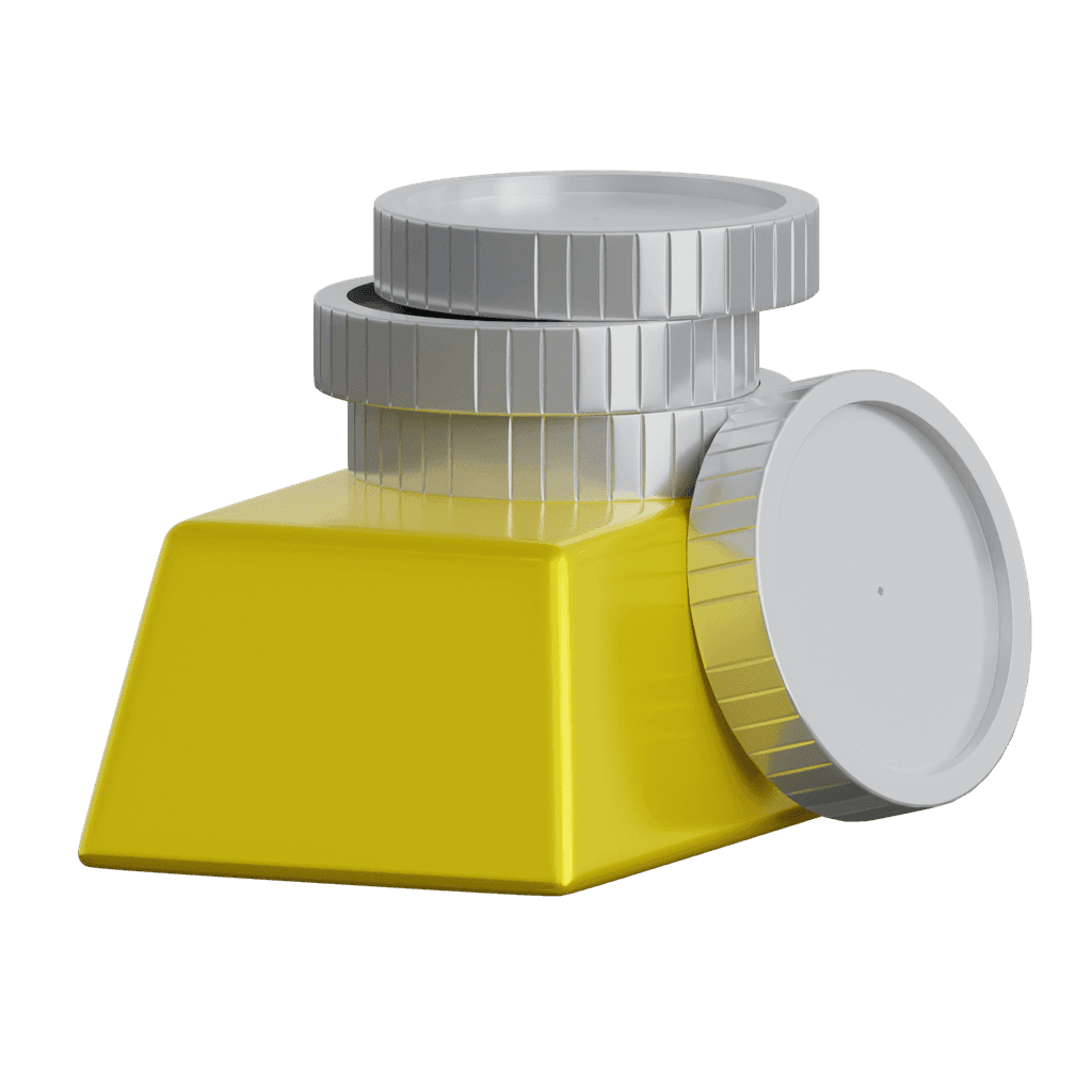
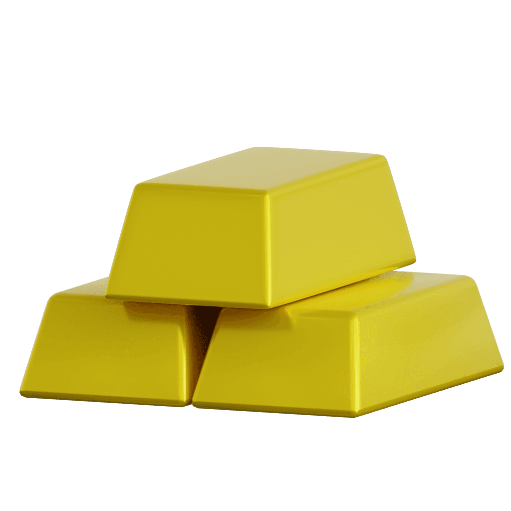
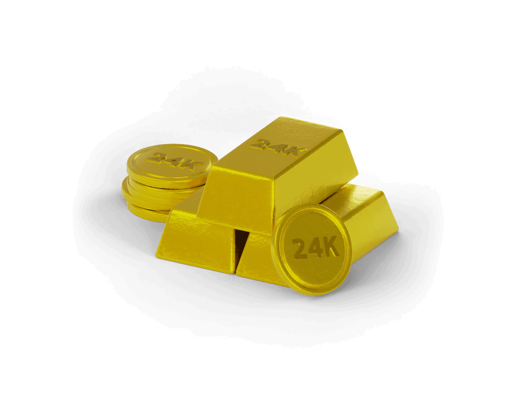
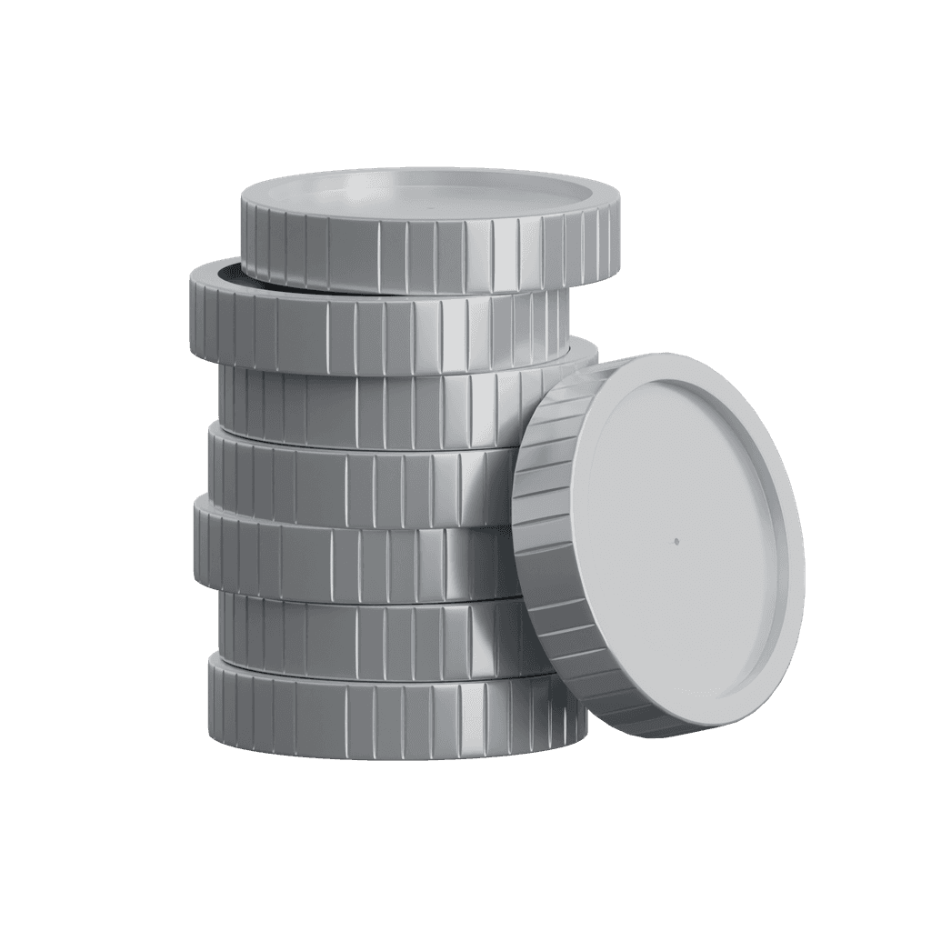
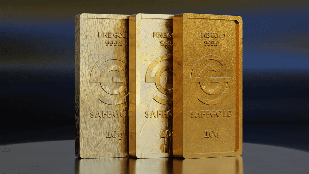
In addition to the product design, I also developed these 3D assets to meet overall visual asset requirements across UI, branding, and other communications.
Challenges
As an experienced motion designer, the 2D animations and collaboration with the UI and illustration teams were relatively smooth. However, I aimed to push the boundaries by experimenting with an eccentric concept inspired by Pixar's *Luca* texture transformation. This presented the biggest challenge in the exercise, as it required extensive research to grasp the 3D mechanisms and develop my own texture rig animation setup.
Approach
Given the complexity of the Gold revamp project, I ensured that the concepts and visualizations I intended to explore were thoroughly documented with detailed ideation sketches. This approach allowed me to pitch my ideas effectively to the Design Directors and Product Managers, securing their approval before dedicating time to develop the final product.
Impact
The gold revamp was highly successful, with reports indicating improved conversion metrics and increased user engagement on the gold page compared to the previous version. I also received significant recognition within the organization for this innovative design, marking it as one of the first of its kind at PhonePe.
