Overview
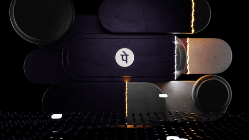
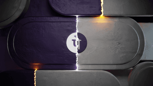
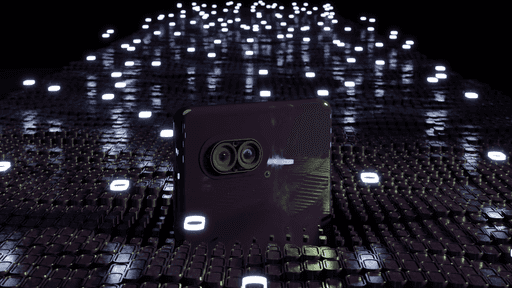
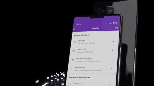
A launch video for the long-awaited feature on PhonePe - The Dark Mode. This is a 3D launch video which I was responsible for making fully end to end and build all aspects of the launch video, including 3D models, lighting, texturing, animation, etc.
Main goal of this project was to come up with an unique and engaging launch video to celebrate this feature launch and share it across for PR, Blogs, Social media etc...
Objective
The Dark Mode feature on PhonePe was a long-awaited ask from all our customers. So the Design team got together to audit through the app and find all touchpoints where we need to work to bring the best experience in Dark Mode. Alongside this, the internal team and leadership strongly suggested we also have a launch video for the same. I happily took on the opportunity as a 3D motion designer to get started on it and create an interesting and engaging launch video.
My Role
As the sole 3D designer in the PhonePe design team, I was responsible for creating the storyboard and building all elements of the launch video, including 3D models, lighting, texturing, and animation. Additionally, as the owner of the motion design charter, I ensured that all motion design assets were fully optimized and ready for handoff in preparation for the launch of PhonePe's dark mode.
Spot loaders (Dark mode)
Spot loaders, or illustrative loaders (more on this in the project link), also needed optimization for dark mode. However, bundling two different Lottie files for both light and dark modes would have been impractical, as it would double the app size for each asset. For instance, if a spot loader is 25KB, supporting both modes would require bundling separate background colors, doubling the file size. To address this, I collaborated with the developers to implement a solution where a background container is set for the Lottie animation, and its color adapts according to the design system. This allowed us to use a single Lottie animation asset while supporting both light and dark modes.
3D Storyboard
As this was PhonePe's first in-house 3D launch video, it was crucial for stakeholders to get a clear sense of the final look and feel. This was important to gain approval for the 3D approach from the outset. Without this, we might have ended up with a generic launch communication simply announcing that PhonePe had launched Dark Mode. To avoid this, I created detailed storyboards to facilitate discussions and move the project forward.
Challenges
Working alone in 3D was challenging as I had to entirely come up with the 3D animations and clear any roadblocks in implementation. I had to learn many new techniques and tricks to get the exact visuals we had imagined. It was also challenging to convey to stakeholders how different it is from normal 2D animations and how it requires us to finalize iterations before moving on to the final animations.
Approach
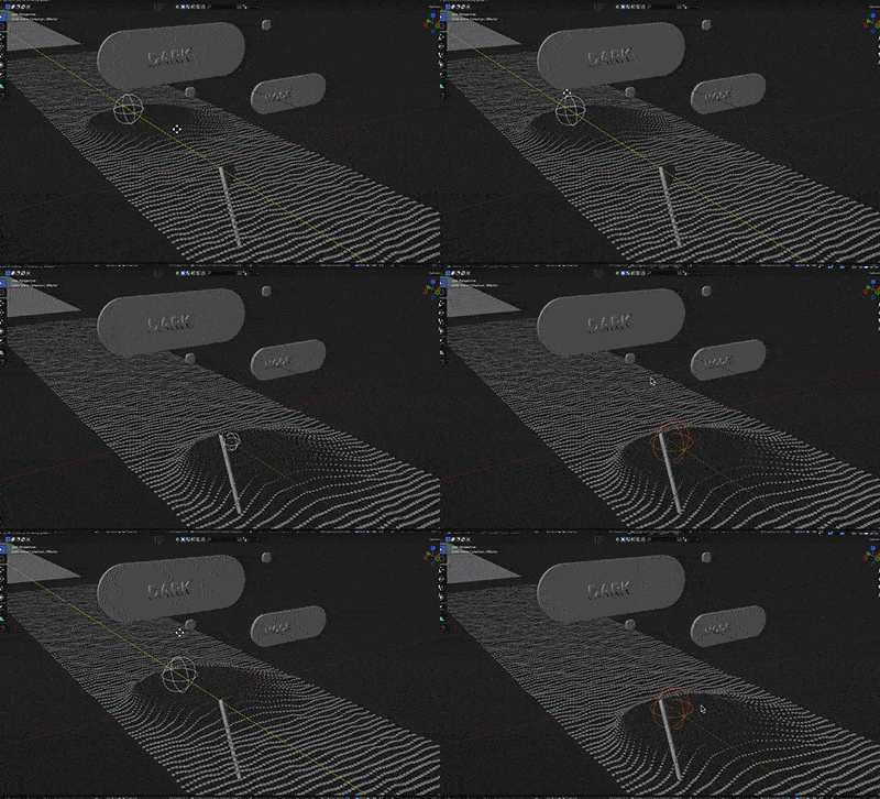
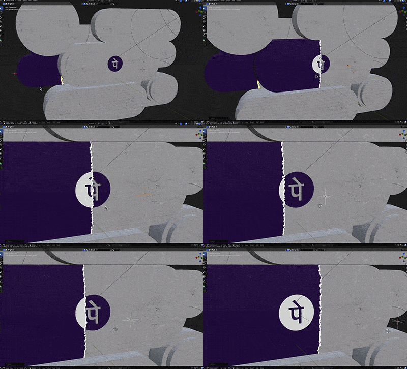
After I closed the storyboard slides and incorporated valuable inputs, I proceeded to create the base assets required for the scenes and shots. I started building basic camera movements and animations and rendered them separately as different shots so that it’s easier to process on the laptop. The mobile UI animations were animated in After Effects and applied as a texture in Blender. Once the animated shots were all ready, I started adding the right textures and lighted up the scenes. I proceeded to render them all and started compositing in After Effects for the final touches.
Impact
Working alone in 3D was challenging as I had to entirely come up with the 3D animations and clear any roadblocks in implementation. I had to learn many new techniques and tricks to get the exact visuals we had imagined. It was also challenging to convey to stakeholders how different it is from normal 2D animations and how it requires us to finalize iterations before moving on to the final animations.
Lessons
If we set aside the time and energy to build something huge, it’s possible to get there. We need to learn that good things take time and learn how to balance it with ever-evolving BAU tasks. Once your stakeholders and leadership team understands the capabilities, it’s also possible to work on complex videos like this in-house.
