Objective
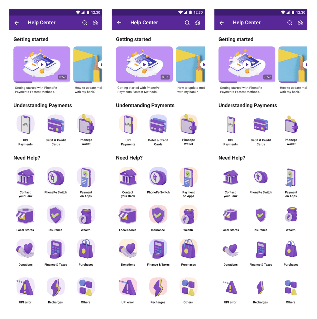
Our primary objective for the Help Center revamp was to create a more welcoming and intuitive Help section interface. The previous version was overly text-heavy, making it difficult for users to navigate and locate their issues. The new design aimed to simplify the experience, improving ease of use and resolution efficiency.
Overview
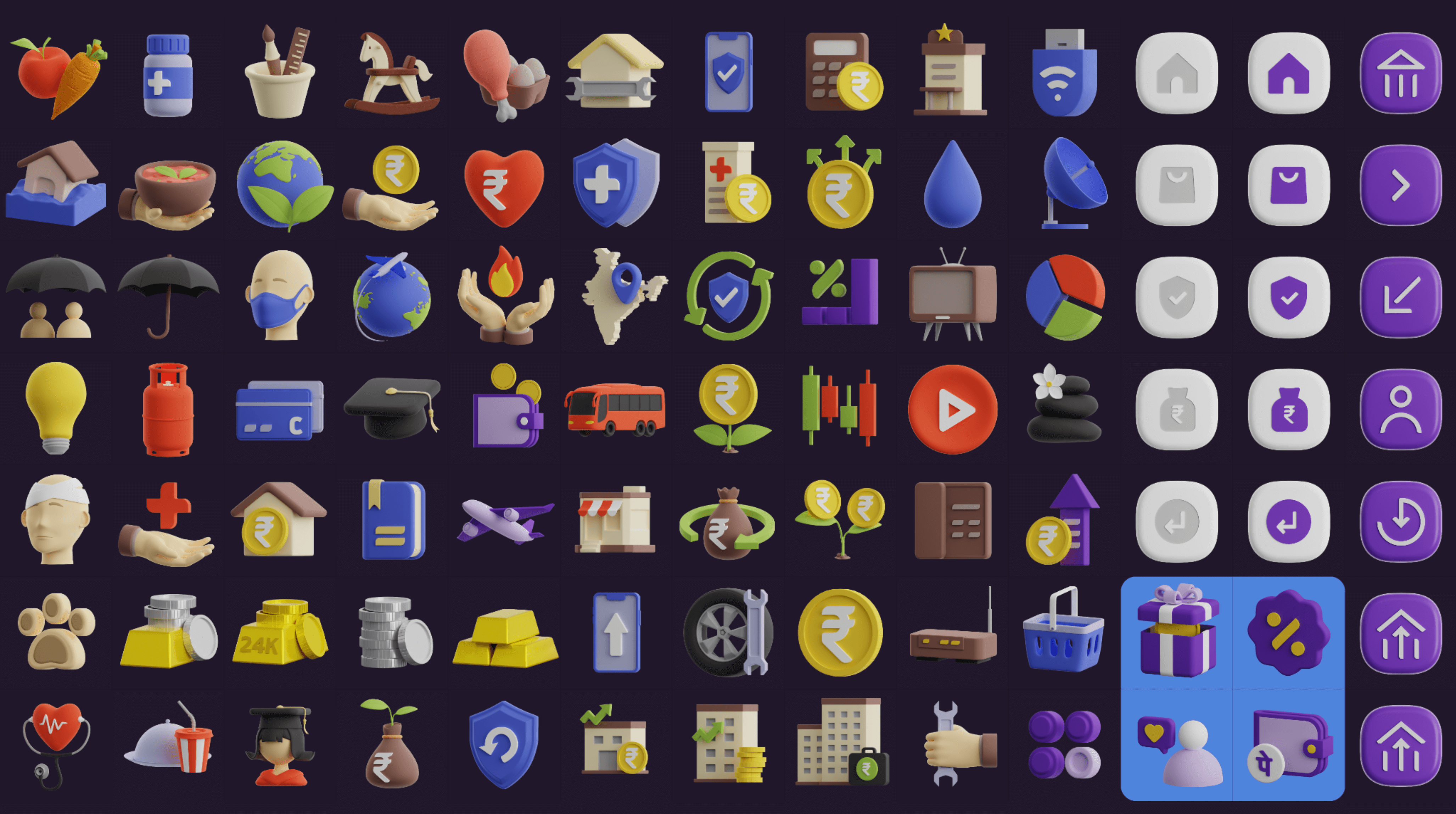
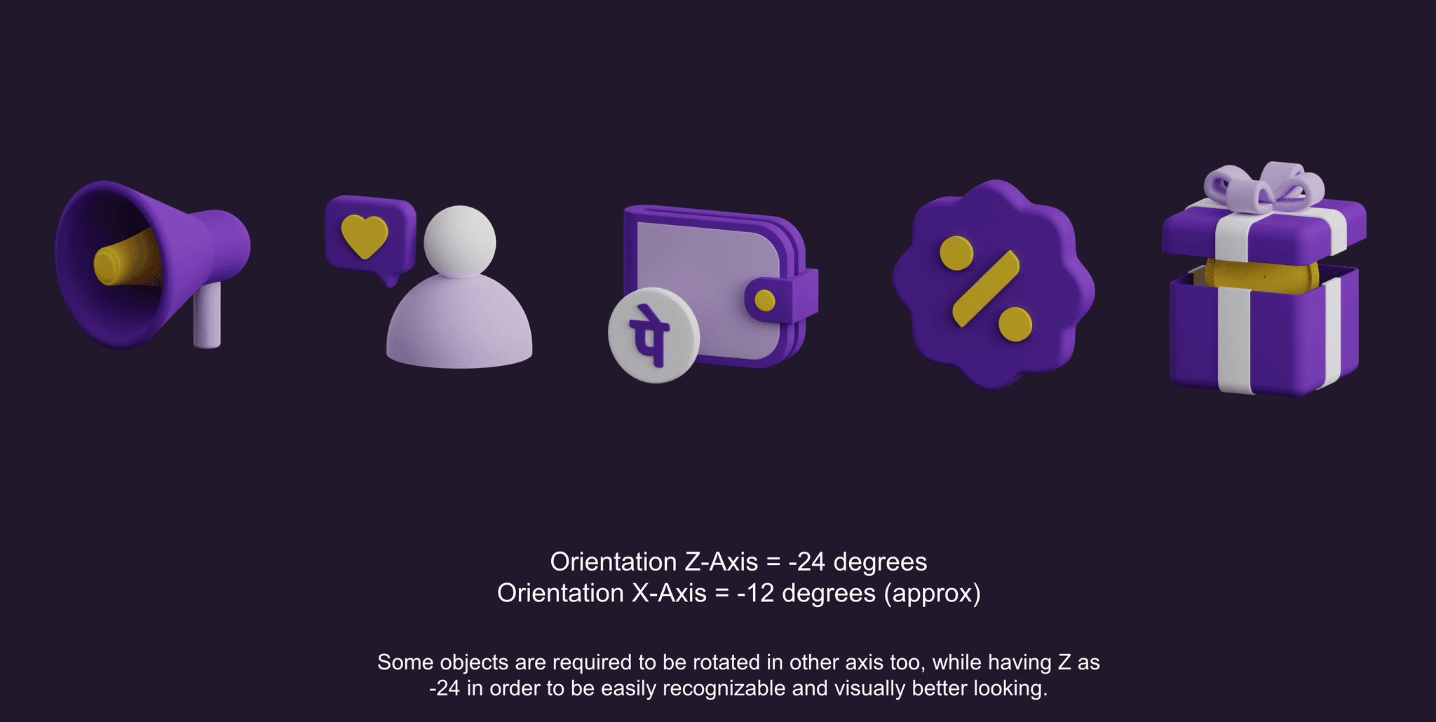
Given that I had already developed a 3D icon library while preserving style and brand identifiers, it made more sense to utilize this existing 3D library rather than create a new 2D style. The requirement was for warm, welcoming, simple, and intuitive icons for the master page, which is a key point of entry.
Implementing 3D-styled icons in the app was a significant debate and discussion, as it was the first time we were introducing this style live.
My Role
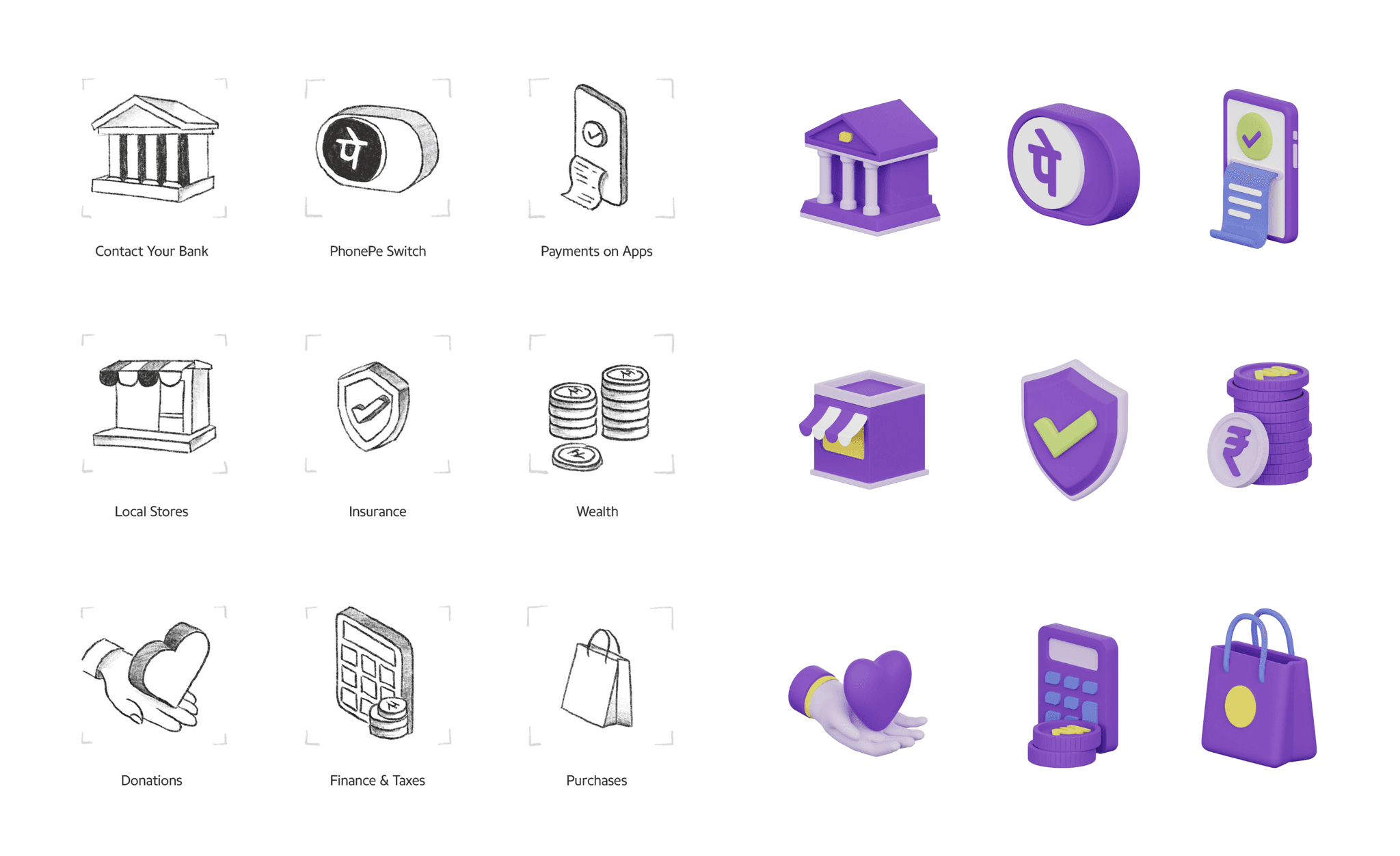
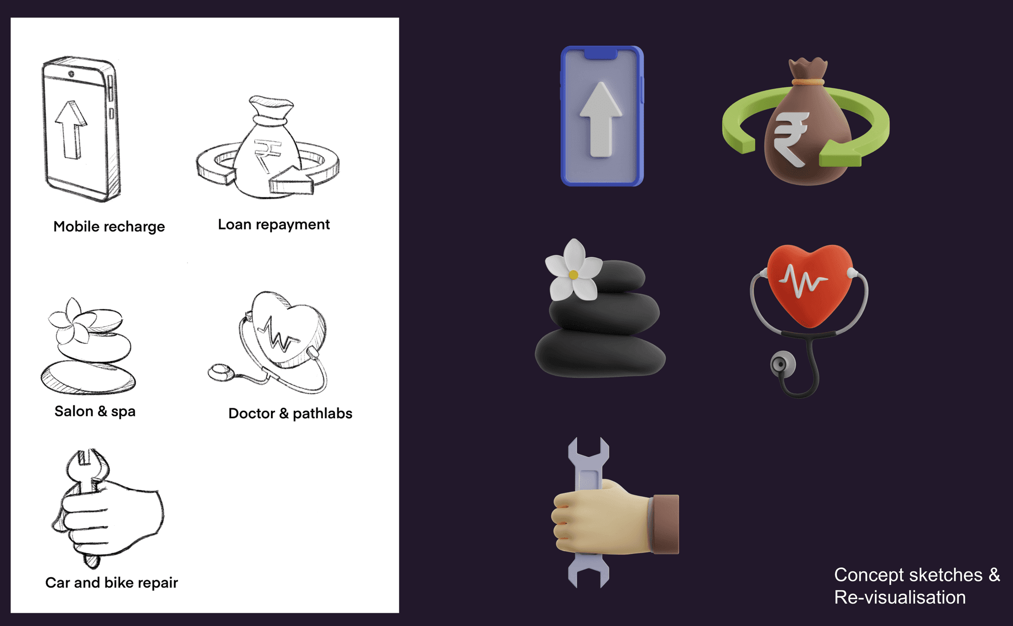
My role was to analyze user flows and identify touchpoints where the 3D icons would be effective. Beyond the homepage, the same 3D icon library was applied to list category icons, so I ensured that the size, volume, and shape were suitable for both touchpoints. I also experimented with icons using their original color themes instead of PhonePe's color palette, which we will review later on this page. The Design Excellence and UI teams contributed ideation sketches for these category icons.
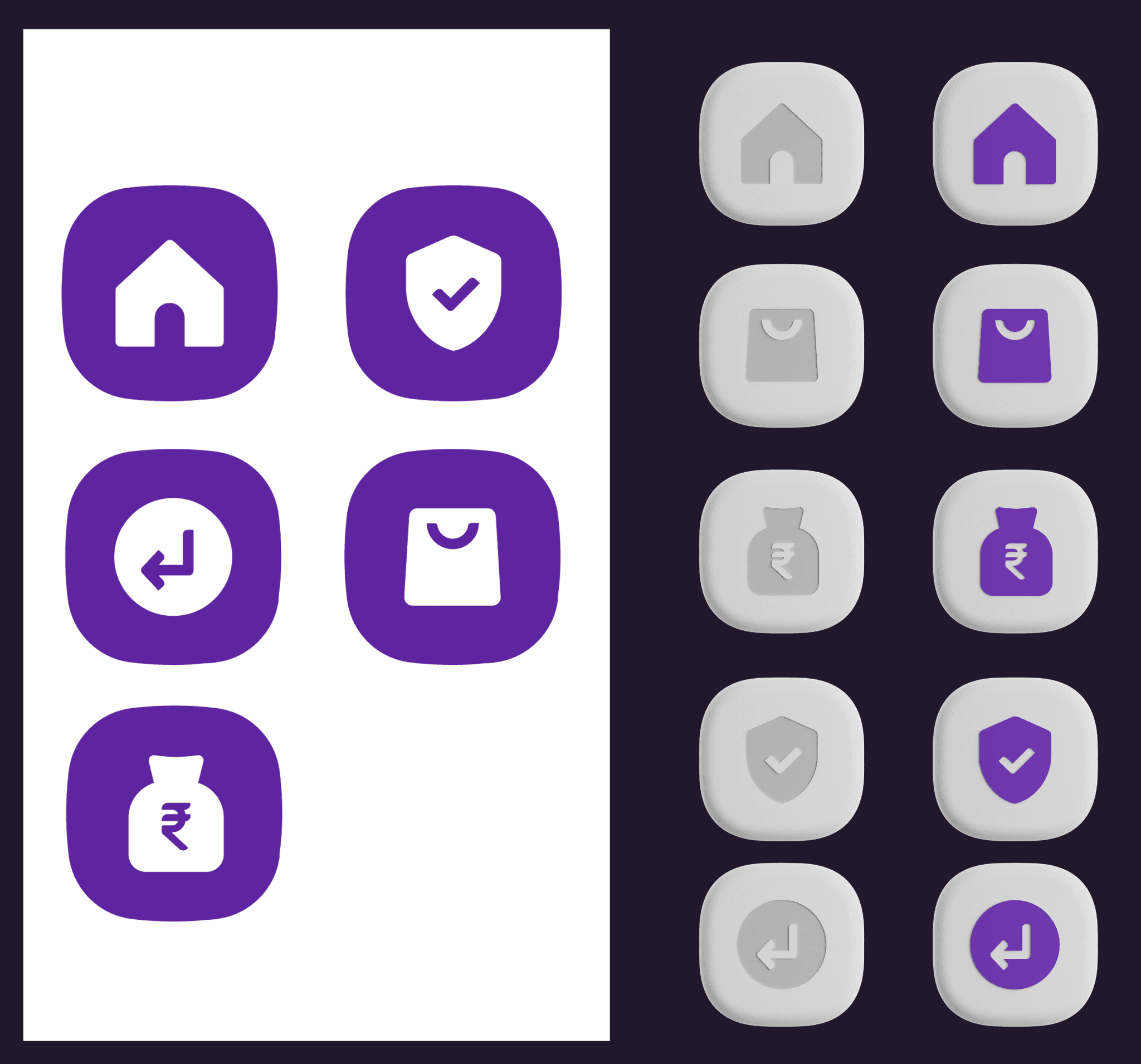
Ideation Sketches vs the Final look
Building upon the previous PhonePe 3D icon exercise, (you can read more about it here) we refined and implemented those 3D icons for the Help Center revamp. This was an ideal opportunity to leverage 3D icons, as we aimed to make them more literal in appearance. Additionally, the ability to use 32px+ icon sizes for the master page icons allowed us to enhance their visual impact where these icons were utilized.
From behind the scenes
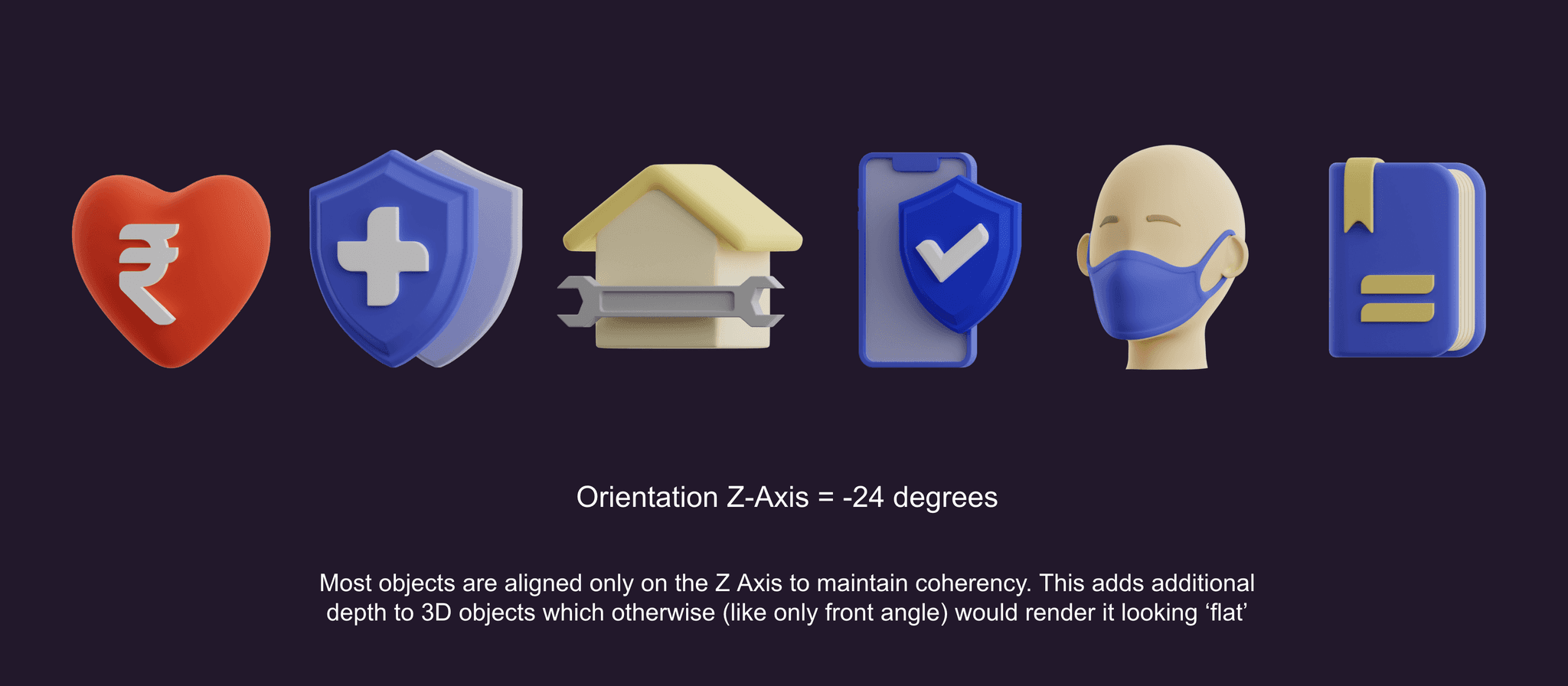
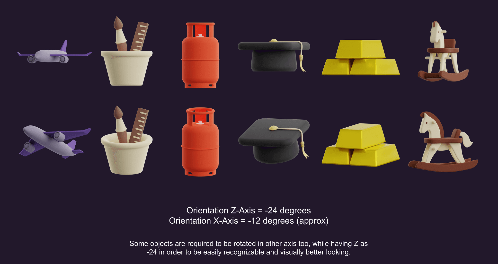
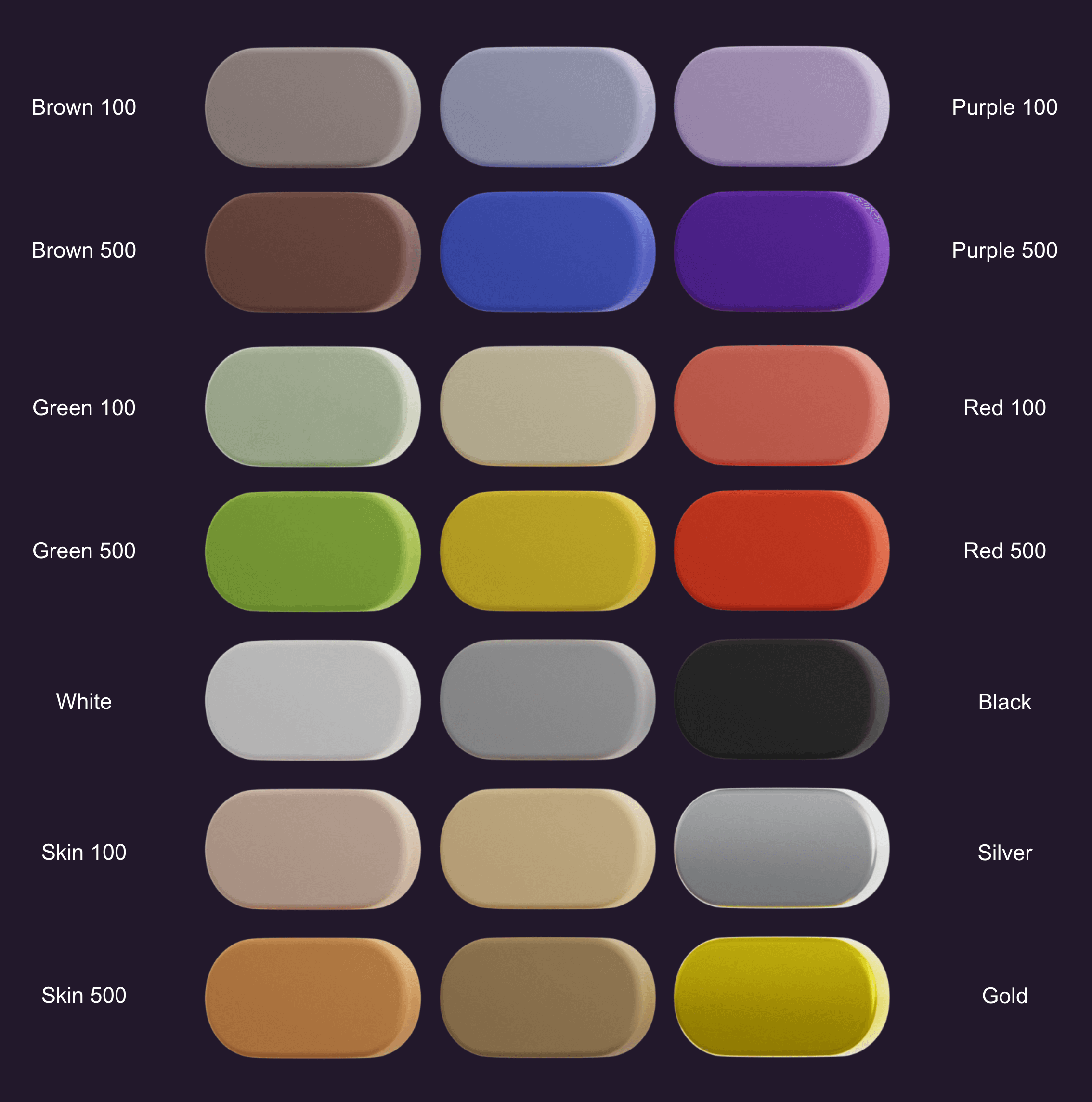
Here are some notes from the exploration files highlighting subtle yet important aspects of maintaining design consistency while working on 3D icons. Additionally, I created a 3D icon material library combined with a light rig in Blender, which ensured that any new icons developed would maintain a consistent look and feel.
Challenges
We aimed to innovate beyond our traditional 2D icon system by adopting a 3D style, which sparked considerable debate and discussion about scalability. Although the process was challenging, we were fortunate to see many competitors already embracing the 3D trend. The initial stage required significant effort, including many days, nights, and weekends to develop the first library. This foundational work ultimately convinced everyone to proceed with the 3D approach.
Approach
I employed several methods to create a fundamental guide system in Blender, and I believe there is still room for improvement. Key to maintaining icon style consistency were the use of bordered planes as volume guides, a singular lighting system with consistent settings, and a color material library to adhere to a strict 2-3 color palette.
Impact
The overall revamp led to a decrease in escalations, as reported by our CX team. We were very pleased with the recognition of our efforts for adopting an innovative approach to the UI and icon redesign.
Lessons
Building a solid 3D system can be time-consuming, but once the initial effort and hurdles are overcome, it becomes second nature. If I had to redo the entire exercise for a new app, the process would be much more streamlined and efficient.
