Overview
In 2020, while working closely with the CoDesign team, we aimed to create a dynamic brand identity system that allowed PhonePe to express its unique voice and enhance brand recall across its expanding array of experiences. As the lead motion designer, I was keen to contribute to the evolution of PhonePe's brand expression, influencing everything from marketing promotions to engaging product experiences.
My Role
My role involved innovating the evolution of PhonePe’s brand identity to create delightful, meaningful, and functional product motion experiences. This project highlights some of the most recognizable motion experiences in PhonePe today, including payment animations and bottom navigation. I also documented the progress made in evolving these motion experiences in a short video, which showcases the advancements achieved.
Bottom Nav Revamp
I had the opportunity to contribute to the 2020 visual revamp of the PhonePe app, where I was responsible for creating the Bottom Nav animation for the project.
Here's a look at the final version we experience today.
Payment Success
It was a rewarding experience to work on revamping the PhonePe payment processing and success states, ensuring a seamless and intuitive experience for our users in the visual revamp 2020.
Here's a look at the final version we experience today.
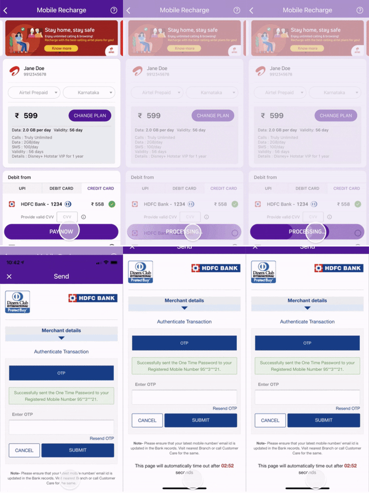
Checkout processing button
We also opted to display the checkout processing loader in a progress-style format, indicating the ongoing process and signaling that the user is transitioning out of the app.
You can read more about UI loader design here.
Touch Interactions & Shimmers
I ensured that even the subtle touch interactions and shimmer animations were crafted with our brand identity in mind, focusing not only on functionality but also on creating an aesthetically pleasing user experience.
You can read more about UI loader design here.
Design System Components
Here’s an example of how the beam concept was integrated into the design system components. I applied my expertise to implement loading states within button components, reflecting the inspiration from the beam design.
You can read more about UI loader design here.
PhonePe payment animations over the years
Over the years, and even before the PhonePe brand revamp, I worked on several iterations of the payment animations for PhonePe. In this video, I’ve gathered a few early motion designs and prototypes to showcase the evolution of PhonePe’s payment animation over the years.
Challenges
In this project, success was measured by several parameters:
- Intent Clarity: The motion design needed to clearly convey its purpose to users. For instance, loading animations should be easily recognized as loaders without causing cognitive strain.
- Technical Efficiency: Ensuring that assets were lightweight to avoid performance issues, especially on older devices, was crucial. This included minimizing RAM usage and optimizing overall performance.
These challenges were key focuses in achieving an effective and efficient motion design for payment animations, loaders, and the bottom navigation.
Impact
Collaborating with UX designers, I discovered that the transition from the old app to the new, visually revamped version led to users reporting greater ease of use and improved metrics overall. The rollout became one of the most recognizable in the market, with significant marketing efforts centered around the new motion design. Public feedback on social media and in reports highlighted that users found PhonePe to be delightful and engaging.


